Blog 1: Discovery Before Design


When you look at a beautifully crafted website, you see elegance, motion, clarity — but you rarely see the **Discovery** behind it. Yet, the Discovery phase is where the magic begins. It is not just the starting line — it is the beating heart that sets the rhythm for everything that follows. Without Discovery, a website is just another template. With it, it becomes a digital mirror of purpose. At WebForge Studio, Discovery isn’t a checklist. It’s a **deep creative excavation**. Before we touch design tools or code editors, we immerse ourselves in your world. We explore your brand’s soul. What do you stand for? What makes your audience care? What stories do you need your platform to tell? Every question peels back a layer until we reach the core. We begin with strategy sessions that feel more like creative therapy. We don’t just want to know your industry — we want to know your identity. We ask about your dreams, your competitors, your setbacks, and your boldest aspirations. The more we know, the more powerful your final site becomes. Because the truth is — the more we discover, the less we assume. And in the digital world, assumption is the enemy of excellence. Next, we dive into research. Not shallow Google searches — we go deeper. We analyze your audience’s behavior, map out their frustrations, and figure out exactly what their expectations are when they land on a website like yours. We build user personas that feel real. We sketch emotional journeys. We ask: what should your customer feel at first glance? What triggers trust? What breaks it? This is where empathy becomes engineering. We gather analytics, conduct surveys, study competitors’ digital footprints, and identify content gaps. But more than that, we listen. Because building a website isn’t just a tech project — it’s a human one. Our role during Discovery is to **amplify your unique voice**, and we can only do that by understanding what makes you unforgettable. Once we’ve unraveled your narrative and clarified your goals, we translate that into action. We craft your **Discovery Blueprint** — a powerful strategic document that defines everything from site architecture to messaging tone. It includes your visual identity direction, key user objectives, content priorities, and functionality outlines. Think of it as the master map — a creative north star that guides every team member, from designers to developers. This process changes everything. Many of our clients walk into Discovery unsure of what they really want — and walk out seeing their brand in an entirely new light. That’s the power of guided reflection. That’s what makes Discovery not just valuable, but transformational. But here’s the best part: Discovery saves time, money, and revisions down the line. It prevents endless rounds of guesswork. When you invest in Discovery, you build a foundation that’s solid, strategic, and scalable. Every click, every scroll, every visual cue will have meaning behind it — not just aesthetics. In a world full of rushed web projects and cloned templates, Discovery is what sets you apart. It’s the reason your visitors stay longer. It’s the reason they trust you faster. It’s the reason your message lands and lingers. So if you’re thinking about building a website, stop and ask: Have you discovered who you are online? Because when we start with clarity, the result is always a masterpiece. **At WebForge Studio, we don’t just design websites. We discover destinies — then we bring them to life.**
Blog 2: Mobile‑First Mindset


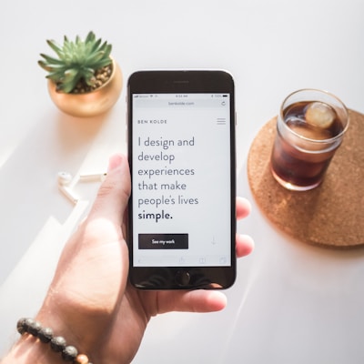
Pull out your phone. Open any website. Now ask yourself — does it *feel right*? Is it effortless to navigate? Does it load fast, adapt gracefully, and keep your eyes engaged without overwhelming them? If the answer is yes, then congratulations: you’ve just experienced the power of a **Mobile-First Mindset** — and it didn’t happen by accident. At WebForge Studio, we don’t just optimize for mobile — we **start** with mobile. We flip the old-school web design model on its head. Why? Because the world has changed. People no longer browse on desktops — they scroll while standing in line, tap while waiting for coffee, and swipe before they sleep. Your website is in their pocket, not on their desk. So we design with thumbs in mind. Literally. A Mobile-First Mindset means asking bold questions at the very beginning: - What is the most important thing users need to see *first*? - How can we keep them engaged without crowding their tiny screen? - Can a single finger navigate this website with no friction? Most agencies treat mobile as a “responsive” afterthought — shrinking down a desktop site and calling it done. We see that as a digital disservice. Instead, we begin with a minimalist, intuitive mobile layout, then scale it up beautifully for tablets, laptops, and large screens. The result? A site that feels **native** to any device — not forced. Our process is rooted in intentional simplicity. Every button is placed where the thumb naturally lands. Text is large enough to read without squinting, but compact enough to maintain elegance. Calls-to-action are bold, animations are subtle yet stunning, and load times are lightning-fast even on slow mobile data. But Mobile-First isn’t just about shrinking the screen — it’s about **reframing your message**. Mobile users think differently. They want quick value, emotional clarity, and intuitive navigation. That means we lead with your strongest benefits. We cut the fluff. We craft headlines that hook instantly, visuals that tell stories fast, and layouts that guide users effortlessly toward conversion. Did you know that Google now ranks your mobile version higher than your desktop version? That’s right — search engines are mobile-first too. Which means if your mobile UX is clunky, your visibility suffers. With us, that never happens. We optimize not only for design, but also for SEO, speed, and smooth animations across all screen sizes. Here’s the secret sauce: when your mobile site is flawless, your brand feels *closer* to people. There’s a sense of immediacy and intimacy when a site feels like it was made for your hand. That emotional connection? It builds trust. It drives clicks. It converts. Mobile-first design also sets you apart in crowded markets. While others drown in bloated desktop designs and sluggish load times, you rise above with a crisp, bold, touch-optimized experience that feels modern, fast, and frictionless. And let’s not forget accessibility. A mobile-first site naturally encourages inclusivity — with large tap areas, clean layouts, and clear contrast ratios. Everyone wins — users with disabilities, older audiences, and even distracted multitaskers. At WebForge Studio, we bring all of this together through a fusion of research, prototyping, animation, and next-gen development tools. The result? A site that feels like it was custom-built for the user — because it was. So if you’re still treating mobile as “secondary,” you’re missing the entire wave. The brands dominating today are mobile-first — not because it’s trendy, but because it’s **what users demand**. Your site should be a joy to explore — anytime, anywhere, on any screen. Because today, the future of the web fits in the palm of your hand. And if you're ready to lead with elegance, speed, and clarity, we’ll help you build it — one swipe at a time.
Blog 3: Design That Feels


When people visit a website, they don’t just see colors, fonts, and animations. They feel. They feel ease or confusion. Curiosity or boredom. Trust or doubt. That’s why at WebForge Studio, **design isn’t just visual — it’s emotional**. And we believe that great design doesn’t just look good — it feels *right*. In an age flooded with templates and cookie-cutter layouts, the true magic lies in creating **designs that speak directly to the heart**. The kind of design that makes your audience stop scrolling, lean in, and say, *"Wow… this gets me."* This is what we call **“Design That Feels.”** It's a philosophy rooted in empathy and powered by creative psychology. It’s about building experiences, not just screens. When we begin designing your website, we don’t rush into aesthetics. We begin with **emotion mapping**. What should the user feel the moment they land on your homepage? Confidence? Calm? Excitement? Urgency? Once we identify that core feeling, every single design choice becomes intentional. The typography, color palette, animations, layout spacing — it’s all layered to create a **mood**. Imagine soft gradients that soothe, or bold geometric patterns that energize. Micro-interactions that reward every click, scroll, or hover. Fonts that echo your tone — elegant for luxury, bold for innovation, playful for creatives. Every pixel carries meaning. But here’s the thing: **Design That Feels is never accidental**. It’s engineered. We use real neuroscience and design psychology to build emotional flow. We study how users scan content, how their eyes move, and how colors impact decision-making. We test shadows and spacing not just for balance, but for comfort. Because comfort leads to clarity. And clarity builds trust. Our process includes crafting **high-fidelity mockups** that are more than just pretty — they’re prototypes of user feelings. You’ll see not just what the site looks like, but how it behaves — how it breathes. We’ll walk you through animated transitions, mobile swipes, parallax depth, and fluid visual rhythms that create a **living experience** on every device. What separates amateurs from masters in web design? **Feeling**. Anyone can drag and drop components. But creating a sense of calm in a finance app, or a sense of wonder in a travel blog? That’s a different level. That’s soul-driven design. The truth is, people don’t remember content — they remember how your brand made them feel. And if your design makes them feel inspired, safe, or seen, you win their loyalty forever. Great design also increases conversions. Emotional design reduces bounce rates, increases session times, and creates subconscious comfort that drives action. When your layout feels like a story — not just a sales pitch — users are more likely to stay, trust, and click. At WebForge Studio, we don’t just offer beautiful interfaces — we offer **digital empathy**. We help you show up online with emotion, elegance, and edge. Because design without feeling is forgettable. And your brand was never meant to be forgotten. So, let’s go beyond pretty. Let’s go beyond responsive. Let’s build a digital presence that doesn’t just display your brand — it **feels like your brand**. In a world of lifeless pages, it’s time to create something that beats with emotion. That’s what we do. That’s what we forge.
Blog 4: Fast, Scalable, SEO‑Ready Code


It’s not just about how your website looks — it’s about how it **performs under pressure**. Behind every stunning layout and smooth animation lies a world of intelligent, well-written code. At WebForge Studio, we build **fast, scalable, SEO-ready codebases** that silently power experiences your users never forget. Think of your website like a luxury sports car. The design is the body — sleek, stylish, attention-grabbing. But the engine under the hood? That’s your code. And unless that engine is optimized for speed, strength, and agility — you’re not winning any races. Let’s break it down: 💡 **Fast Code Wins Attention.** Every second counts. Studies show that if your website takes more than 3 seconds to load, over half your visitors vanish. Gone. That’s revenue lost before your first headline even shows. We optimize every asset — compressing images, eliminating bloat, and writing lean, modular code that loads fast and flows flawlessly. Using frameworks like Next.js, modern JavaScript libraries, and advanced build pipelines, we reduce load times dramatically. Our CSS is clean, our HTML is semantic, and our JavaScript is structured to run light — even under heavy traffic. 💡 **Scalable Code Grows With You.** You’re not building a website for today — you’re building for the next 5 years of your brand. That’s why our architecture is built for **growth**. Whether you're a startup scaling to enterprise level, or adding features down the line, our code is modular, component-driven, and easy to expand. We don’t hard-code dead ends. We write flexible systems: reusable components, API-ready integrations, and forward-compatible updates. Whether you’re launching a blog today or an eCommerce platform next year — we’re already preparing your foundation. 💡 **SEO-Ready Code Gets You Found.** A beautiful website that no one sees is a digital ghost town. That’s why we bake **search engine optimization** into the very DNA of your code. We use semantic HTML5 structure, proper heading hierarchy, accessible labels, lazy-loading, and meta tags that speak Google’s language fluently. Our sites are built with crawlability and ranking in mind — no gimmicks, just real technical SEO. We implement JSON-LD structured data, optimized image alt tags, dynamic Open Graph metadata, and blazing-fast Core Web Vitals performance. 💡 **Security, Accessibility, and Best Practices? Always.** We code with security protocols in place — using HTTPS encryption, sanitization methods, and GDPR readiness. And we never forget accessibility. Your site will be navigable with screen readers, keyboards, and assistive tools — because inclusive design is powerful design. 💡 **Developer-Friendly for the Long Run.** Our code isn’t just clean — it’s **developer-friendly**. That means if another dev ever picks it up, they’ll understand it instantly. We use naming conventions, comments, documentation, and structured folders so your website remains maintainable for life. 💡 **It’s Invisible, but Unforgettable.** Visitors may never see the code behind your site. But they’ll **feel** it. They’ll feel it in how fast your site loads. In how fluid the animations run. In how easy it is to find you on Google. And in how future-proof your entire digital presence becomes. At WebForge Studio, we believe that true digital power comes from beneath the surface. From a codebase that’s crafted like fine art — but structured like solid steel. No fluff. No shortcuts. Just fast, scalable, SEO-ready architecture built for brilliance. Because in this online world, it’s not enough to look amazing. You have to be engineered for performance. And that’s exactly what we deliver — line by powerful line.
Blog 5: Client Transformations


At WebForge Studio, we don’t just build websites — we **transform businesses**. From raw vision to digital elevation, we take clients on a journey that reshapes how they show up online… and how the world sees them. Because let’s be honest — every brand has potential. But potential alone isn’t power. Power comes from execution. From innovation. From turning that “what if” into a “look at us now.” This blog isn’t about code. It’s about **courage** — the kind of courage our clients show when they trust us to turn their boldest ambitions into real-world platforms. What we deliver? **Digital transformation stories that inspire.** 🌀 **Before WebForge: Confusion. Invisibility. Missed opportunities.** We’ve worked with clients who came to us frustrated — websites stuck in the past, mobile experiences that broke on every screen, slow-loading portfolios that chased away leads. Some were talented creatives with no digital stage. Others were established brands, trapped by outdated tech and generic templates. What did they all have in common? They needed someone to **see beyond the surface**. 💥 **After WebForge: Clarity. Confidence. Conversion.** We redesigned more than interfaces — we redefined **brand essence**. One client, a small interior design studio, went from Instagram-only to a stunning full-service site with interactive 3D room previews. Another, a global consultant, saw traffic grow 300% after we rebuilt their site with lightning-fast architecture and AI-driven content suggestions. What changed? **Everything.** Their brand felt alive. Their audience felt seen. Their message felt undeniable. 💎 **Real Results. Real Growth.** Our transformation process starts by listening deeply — to your pain points, your goals, and the soul of your business. Then we architect a custom digital experience that elevates your entire identity. One fashion startup saw their bounce rate drop from 72% to 11%. A travel blogger grew her mailing list from 1,000 to over 15,000 in four months. An NGO we partnered with now runs campaigns through a fully automated, scalable web platform that reaches thousands weekly. This isn’t just web design. It’s **business design**. 🌍 **Transformation That Resonates Worldwide.** Whether you're a solopreneur in Nairobi or a brand manager in New York, our process is universal: Discover → Design → Develop → Deploy → Dominate. And every single stage is built for **impact** — on screens, on search engines, and in people’s hearts. When your website reflects your full story, your customers respond. You don’t just get clicks — you get **conversions**. You don’t just gain followers — you build a **tribe**. ✨ **Our Clients Don’t Just Grow — They Glow.** They walk into boardrooms prouder. They pitch bigger clients. They raise prices. They shift from begging for attention… to owning their spotlight. Because the truth is: > A beautiful website might get applause. > But a **transformation**? That gets results. When you partner with WebForge, you're not buying a website. You're investing in your next level — the version of your business that finally commands the respect it deserves. So if you're tired of blending in… If you're done settling for mediocre… If you're ready for a website that works as hard as you do… Let’s build something remarkable. Let’s build the **transformation you’ve been waiting for.** Because you’re not just another client. You’re our next **success story**.
Blog 6: All Kinds of Website Designs


In the vast digital landscape of today, websites are no longer just online brochures — they are living, breathing digital experiences that shape brands, convert users, and captivate audiences. At WebForge Studio, we don't believe in one-size-fits-all solutions. Instead, we forge unique designs for every purpose and personality — from bold ecommerce storefronts to elegant personal portfolios, from interactive landing pages to fully-loaded enterprise dashboards. Let’s explore the stunning world of all kinds of website designs — and how we turn your ideas into living digital masterpieces.
Whether you're a startup founder with a fresh idea or a corporate executive reimagining your digital presence, the type of website you choose defines your user’s first impression. We start by understanding your goal: Do you need to sell a product, tell a story, capture leads, or create a platform? Based on that, we identify the best structure — and more importantly, the right design language.
For businesses, we craft dynamic **corporate websites** that speak to authority and credibility. These websites use structured layouts, intuitive navigation, and clear value messaging. With subtle animations, call-to-action buttons, and clean typography, users are drawn into a journey — from landing to conversion — in a smooth, professional flow.
For creatives, we specialize in **portfolio websites** that don't just show — they mesmerize. With scrolling galleries, video headers, parallax layers, and stylish content blocks, we make sure your art, photography, music, or writing isn't just seen — it's felt. These websites aren't pages, they're experiences.
Ecommerce? We love it. Our **online store designs** go beyond simple product grids. We incorporate rich animations, smart filters, intuitive carts, mobile-friendly layouts, and seamless checkout systems. Whether you’re selling one product or a thousand, we create designs that sell without shouting.
Let’s not forget the power of **landing pages** — high-converting, laser-focused, minimal but persuasive. Here, we combine psychological triggers with crisp visuals, short-form storytelling, and brilliant performance. Landing pages for SaaS tools, webinars, product launches, and campaigns are designed to spark action — fast.
Then comes the behemoth: **enterprise platforms and dashboards**. These are data-heavy, user-role-driven systems that need clarity, responsiveness, and design discipline. We create modular interfaces, intuitive data visualizations, and seamless workflows for platforms like CRM, HRM, or analytics portals.
What ties all of these together? Our design DNA: frosted-glass effects, modern blur overlays, engaging hover effects, stylish fonts, dynamic sections, and a mobile-first philosophy. Our designs don’t just scale to different screen sizes — they scale to different dreams.
Whether it's a blog for a solo traveler or a mega-site for a global brand, we adapt, design, and deliver. That’s what makes WebForge Studio the powerhouse behind **all kinds of websites**. You dream it. We design it. And we do it with flair, functionality, and future-ready finesse.
